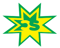
This is my first logo and it is the initials one. In this logo I tried to make it so that the colors will flow from each side to side. Also to make it look better I took the C and turned it backwards. Also I changed the amount of stars in the background to 3 from the original 2.
This is my name logo and I tried to make this one simple. I wanted a thick font in front for my first name and then a thin one for my last name. I also wanted the color to go from light to dark in this logo as well.
In this logo I followed a tutorial for a 3-d shape and made it into my own. I made it look like 2 leaf shapes wrapping around the 3-d looking ball. Also The color add to the effect because the gradients each have 4 different shapes of one color in them.
