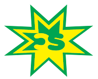
This is my first logo and it is the initials one. In this logo I tried to make it so that the colors will flow from each side to side. Also to make it look better I took the C and turned it backwards. Also I changed the amount of stars in the background to 3 from the original 2.
This is my name logo and I tried to make this one simple. I wanted a thick font in front for my first name and then a thin one for my last name. I also wanted the color to go from light to dark in this logo as well.
In this logo I followed a tutorial for a 3-d shape and made it into my own. I made it look like 2 leaf shapes wrapping around the 3-d looking ball. Also The color add to the effect because the gradients each have 4 different shapes of one color in them.

These logos are awesome. They're very creative however simple. I like it alot. Great job.
ReplyDeleteThe first one is my favorite because of the way you blended the letters with the colors. The only think I don't like about it is the green stroke on the outside. I think it might be nicer a little simpler.
ReplyDeletei like the logos because they're simple.
ReplyDeletei dont like only one color, but boothby just told us about the color thing, so i think your good.
i dont think too much needs to be done with this.
I really like your initial logo. I love how you connected the letters into the star, very creative. I also like the symbol logo, its very different and interesting. Good job!
ReplyDeleteThese are all great! My favorite is the first one because of the way the letters combine with the star. Your last one reminds me of the pepsi logo but not exactly which is good. I think your name logo might look better with a straighter font for your first name but otherwise great work.
ReplyDeleteI like the first and last logos a lot. The first one flows the letters into the star and its sick. The last one has the really cool symbol. I would try to do something more creative with the second one. You should try adding some color.
ReplyDeleteI like the first logo the best. I think you did a very good job using color which made it flow. The star is also a very unique design. I might change the second logo some, however. I think it is a little too plain, and could use some color.
ReplyDeleteThe first logo is REALLY good. i love how it is simple, but flows beautifully. nice job!
ReplyDelete