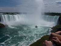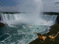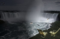
This is the picture that I started with. I used a clone stamp tutorial to help me remove the hands and boat. The picture to the left only shows the hands removed and that is only because I couldn't find the one that I originally used so I just redid it quick so I could put it up on the blog post. After I did this I just added a couple chairs up on the mountain. I got the chairs from a picture on google and cut them out with the magic wand tool.
The tutorial that helped me with the clone stamp tool is in this link:
http://www.youtube.com/watch?v=WcJbN8CA49c
Also the thing that was tricky about the clone stamp tool was that to get the target for the clone you had to hold done alt and then click. After that it was just like using the paint brush.

The next thing I did was find a few pictures of things I could put in the water and in the air. The first picture was the one on the left of the jet skier. Also there were pictures of dolphins, fighter planes, and a diver. In all of the pictures I cut out the parts of the picture I wanted using the pen tool. Then I brought them all into the poster file and put them where I wanted. Now the only thing was trying to make the pictures look like they belonged. To do this I found a mask tutorial that helped me show a little of the water threw. Doing this allowed me to make the pictures look like they belonged in there.
The tutorial that helped me with the layer masks is in this link:
http://photoshoptips.net/2006/07/25/layer-masks/

The last thing I wanted to do to this was add a lighting affect. I wanted to make it look like the night was on one side and the day on the other.
To do this I used a lighting tutorial and went from filter to render to lighting affects and adjusted it as I wanted.
The tutorial that helped me with the lighting is in this link:
http://www.tutorial9.net/tutorials/photoshop-tutorials/mysterious-lighting-effect-tutorial-for-photoshop/
In total I used 6 pictures and 3 tutorials to help me make this fantasy scene poster. Also I wanted to make it horizontal instead of vertical so my dimensions are 18x12 at 300dpi instead of 12x18 at 300dpi. A larger final version can be seen at the top of this post.


