Search This Blog

Tuesday, June 14, 2011

Final For Graphic Design 1


The picture above is my final for graphic design one. The objective was to turn art into graphic design. The piece of art I choose is the one to the left of the soldiers raising the flag. In order to turn this piece of art into graphic design it would have to be understood, send the same message to everyone, and motivate. The way interpreted this piece of art was people moving forward. With all the soldiers leaning forward I  tried to make it seem like the past was gloomy with the clouds and the future after moving forward was happy with the flower graphics. I think I made this design understandable and motivational. The first thing I did was cut out the soldiers and then I made a reflection of them. After that I looked up urban art style tutorials to make it look interesting and that directed me to the website qbrushes.com where I download 3 different brush sets that I used to create some design. After that I outlined the flag to make it look like it was glowing and added text. The design choices where made as I went along. I would use random brushes in different places until I saw something I liked.

Monday, June 6, 2011

Realistic Head Using Photoshop


 This project took me quite a long time to do. It consisted of many tutorial videos from lynda.com. The first thing that I did was watch each of the tutorials and recreate them into parts that I could use on my final picture. To the left there are two of those examples. After that I took a photo of myself to base the shape of the head and hairstyle on. So after that I traced the head shape and created the hair. The hair consisted of 5 layers just in itself and each hair stroke was individually created using the brush tool. After the hair I created the eye and eyebrow. If you click on the smaller picture of the eye you can see that there is a lot of detail in it but when I shrunk it to put it on the final image some of the detail is not visible anymore. Much time was put into using the burn tool to create realistic shadows also. After that was the easiest part of this project, the mouth. All i did was make lips and add a fiber effect to it. That made it look like real lips and then I made some shadows with the burn tool. After that I made the nose. The nose is very interesting as well. It consists of no shapes only shadows made with the selection tool. After the nose was finished a few minor details such as the little shadow under the lips and the shadows in-between the nose and lips. I think in all the picture came out very realistic and the final outcome came out pretty good.

The tutorial series can be view here: http://www.lynda.com/Illustrator-CS5-tutorials/Bert-Monroy-The-Making-of-Times-Square-The-People/77845-2.html?srchtrk=index%3A1%0Alinktypeid%3A2%0Aq%3Athe%20people%0Apage%3A1%0As%3Arelevance%0Asa%3Atrue%0Aproducttypeid%3A2
The psd can be downloaded here: http://www.mediafire.com/?i1cfjomatqbss6q
The picture of myself I based it off could be seen here: http://www.mediafire.com/?i1cfjomatqbss6q

Big Head Project

This is the big head project I did for graphic design 1. The first thing I did was find a few pictures of my friends playing lacrosse. The link for the website that I found these photos can be seen below. After I had my pictures I cut out each of their heads and posted them on separate layers. Then I cut out the bodies and posted them smaller on separate layers. After that I touched up some of the edges with the eraser tool. After that I got a picture of a field, however the only one I could find that was big enough was indoors. To fix that I cut out just the field part and made it a layer. Then I brought in a picture of a forest and blurred it to try to make it a little more realistic. Next I got a picture of a new net and brought it into the picture as well. 

Friday, May 6, 2011

Recycle Motivational Poster


 This is my motivational poster for graphic design. I decided to do recycling and the picture on the right is the original picture that I started with. I made a picture of the recycling logo with my pen tool and then brought it in on another layer above this grass one. Next I followed a combination of tutorials to help me get the grass to be in the shape of my recycle logo. After that I added a couple affects to it including bevel and extrude, drop shadow, and satin to get the look of the logo that you can see on the left below the grass picture here.


These are links to the tutorials that I used to help me create this project:

http://psd.tutsplus.com/tutorials/text-effects-tutorials/create-a-spectacular-grass-text-effect-in-photoshop/

AND

http://www.mrboothby.net/mrboothby/?p=292


After that I needed to create a background for my logo to sit on. I used a tutorial to help me make a grudge effect for the background. First I dragged a photo of crinkled  paper in and then rotated it then I put a white layer under that and set the crinkled paper layer to overlay that gave it the sort of affect seen above. Then I added a green color layer on the and that became my background. After that the only thing left to do was add my text and give it the same affects as the logo above and then I was done.

Tutorials to help me with this second tutorial can be seen here

http://www.bittbox.com/photoshop/photoshop-how-to-make-an-awesome-grungy-paper-texture-from-scratch


The Final image can be seen at the top of the post.

Thursday, March 31, 2011

Fantasy scene poster


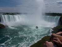
This is the picture that I started with. I used a clone stamp tutorial to help me remove the hands and boat. The picture to the left only shows the hands removed and that is only because I couldn't find the one that I originally used so I just redid it quick so I could put it up on the blog post. After I did this I just added a couple chairs up on the mountain. I got the chairs from a picture on google and cut them out with the magic wand tool.

The tutorial that helped me with the clone stamp tool is in this link:
http://www.youtube.com/watch?v=WcJbN8CA49c


Also the thing that was tricky about the clone stamp tool was that to get the target for the clone you had to hold done alt and then click. After that it was just like using the paint brush.


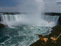
 The next thing I did was find a few pictures of things I could put in the water and in the air. The first picture was the one on the left of the jet skier. Also there were pictures of dolphins, fighter planes, and a diver. In all of the pictures I cut out the parts of the picture I wanted using the pen tool. Then I brought them all into the poster file and put them where I wanted. Now the only thing was trying to make the pictures look like they belonged. To do this I found a mask tutorial that helped me show a little of the water threw. Doing this allowed me to make the pictures look like they belonged in there.


The tutorial that helped me with the layer masks is in this link:
http://photoshoptips.net/2006/07/25/layer-masks/


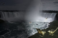
The last thing I wanted to do to this was add a lighting affect. I wanted to make it look like the night was on one side and the day on the other.
To do this I used a lighting tutorial and went from filter to render to lighting affects and adjusted it as I wanted.

The tutorial that helped me with the lighting is in this link:
http://www.tutorial9.net/tutorials/photoshop-tutorials/mysterious-lighting-effect-tutorial-for-photoshop/

In total I used 6 pictures and 3 tutorials to help me make this fantasy scene poster. Also I wanted to make it horizontal instead of vertical so my dimensions are 18x12 at 300dpi instead of 12x18 at 300dpi. A larger final version can be seen at the top of this post.

Wednesday, March 2, 2011


In this video it explains Color theory and color in logo design. It will go over using a color wheel, choosing colors, Adobe Kuler, Color relationships, and Do’s and Don’ts.


Some terminology that will be helpful also is:


Warm Colors: Colors such as red, yellow, and orange. These colors evoke warmth because they remind us of things like the sun or fire.
Cool Colors: Colors like blue, green, and purple (violet). These colors evoke a cool feeling because they remind us of things like water or grass.
Neutral Colors: Gray, Brown. These aren't on most color wheels, but they're considered neutral because they don't contrast with much of anything. They're dull and uneventful.
Value: Usually refers to the amount of black in a color. The more black a color has, the darker its value.
Brightness: Refers to the amount of white in a color. The more white a color has, the brighter it is.
Saturation: Refers to the amount of a color used. When a color is at full saturation, it is extremely vibrant.


I also had 5 sources from which I got my information and they are:

Tuesday, February 15, 2011

My Final 3 Logos


This is my first logo and it is the initials one. In this logo I tried to make it so that the colors will flow from each side to side. Also to make it look better I took the C and turned it backwards. Also I changed the amount of stars in the background  to 3 from the original 2.


 This is my name logo and I tried to make this one simple. I wanted a thick font in front for my first name and then a thin one for my last name. I also wanted the color to go from light to dark in this logo as well.


In this logo I followed a tutorial for a 3-d shape and made it into my own. I made it look like 2 leaf shapes wrapping around the 3-d looking ball. Also The color add to the effect because the gradients each have 4 different shapes of one color in them.